
Jerrica has A Way with Words
Design and Video
Below are design examples including style sheets, posters, web pages, and social media posts as well as short form video. I'd also encourage you to view my Instagram, YouTube, and the layout of this site overall, for more content examples. If you're curious about more of the writing side of content like this, please see my Content and Copy Writing Portfolio.
Quick Menu
Branding and Social Media Posts
Web Page Layout
-
This website
Video and UGC
Website Refresh - Nordic Walkffit
Website copy & design - February 2026
One of the first things I worked on for my ongoing client Nordic WalkFit was a website refresh. This included tightening up the instructor bios, finessing the copy on most other pages, and altering the layout and flow to be more scannable and accessible to viewers.
I chose to use coloured boxes instead of the previous coloured text to highlight important information. These containers allow easier scanning for the important bits. Most of my changes in copy were small but mighty: removing redundancy on the page and small copy editing changes. I tightened up the instructor bios and reformatted them to match the rest of the websites colours. I didn't think there was anything wrong per se about the grey backgrounds but they weren't being used anywhere else so they felt out of place.
The page that went through the biggest change was the "Fitness from Home" page where I found the flow of information felt off. A simple change in order fixed this problem. The focus of the page is Nadine's classes with TopRock so by putting Barb Gormly's website first it doesn't get lost in the bottom but it also doesn't break up the information about Top Rock and Nadine's class.
Here are some before and after images with before on the left and after on the right of each image.

NW Clinics (above) & Home Page (below)


Fitness at Home (above) & Bios (below)

Social Media Mock-Up
Instagram Posts - February 2026
I created these posts as part of a job application. There was no brief, I just wanted to showcase options specifically tailored to the company. I based my design choices on their existing Instagram and website copy and appearance.


On the hunt for some sick shoes to replace your boring old ones? Check out [redacted]'s comfortable, cruelty-free, vegan kiks featuring diverse artists' work. #SneakerHeads#ShoeLovers #ArtistsInStyle
*Notes* Would be great as the first slide in a carousel that showcases actual pairs of your shoes. As a single, having one dirty boring shoe and one of your shoes would be bomb.
Already covered in ink but want more? What if your shoes were designed by a tattoo artist?
#TattooDesign #ShoesLovers #StreetwearArt
*Notes* Would love to showcase a tattoo by the same artist that does the shoes and showcase the shoes in the bottom corner beside the text. Artist tagged.
Artist collaboration with durable, comfortable high tops, slip ons and low tops (and don’t forget we’ve got hats too!)
#StreetwearArt #SneakerHeads #Kickstagram
*Notes* Would be best with non-stock photo actually using your shoes.
Book Launch Media Kit
Media Kit - June 2025
Using illustrations from our talented cover artists, I created a variety of social media posts which could be used to advertise our book launch event. This kit includes an introduction document, suggested post copy, alt text, and graphics optimized for different platforms. It also provided the original art and a simple branding sheet for those who wanted to create their own graphics.
The media kit is housed on a Google Drive, but here is a sample.
Right Now! (day before/day of)
Long form (LinkedIn, Instagram)
Book launch happening TODAY! 📚
The day is finally here! Between 12 and 2pm we’ll be hanging around at The Jolly Taxpayer celebrating the launch of By the Fire: Shattered Reflections. The afternoon will feature readings from five of the stories found inside, refreshments and the chance for you to chat with the authors, editors and illustrators of the anthology.
We’d hope to see you there! 🎉
Alt text:
Text reads: Book launch! Algonquin’s Professional Writing Students published a short story anthology! Meet & Greets. Authors, editors, illustrators. Readings & Refreshments. Join us! June 19th at noon. Jolly Taxpayer 3050 Woodroffe Ave.


A Way with Words Branding
Logo and Branding Sheet - February 2025
This was a project for a design class which included a business card, resume and advertisement banner. The colour scheme is one I’ve been using for a while on Twitch and YouTube, but the logo and font choices are (mostly) new. Adobe Illustrator and InDesign were used during this project.

How-to Magazine Spread
Illustrations - February 2025
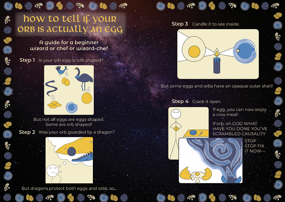
This was a group project with two other team members. The writing, layout and font choices were done by my team; the illustrations, branding sheet and colour scheme were done by me. We were going for a very goofy, very simple vibe. Simplistic and symbolic are where my illustrations shine. Illustrations were created in Illustrator.

Shhhh... I'm Reading Branding
Logo, Branding Sheet and Poster - November 2024
This was a group project with two other team members. While it was a group effort, I did create the logo (with input) and chose the colour scheme. I put together the final branding sheet. The individual parts of the project were to make a branding/promotional material, and I made a poster. Everything was created in Adobe Illustrator.

